![]()
![]()
![]()
Extends the functionality of other plotting packages like
ggplot2 and lattice to help facilitate the
plotting of data over long time intervals, including, but not limited
to, geological, evolutionary, and ecological data. The primary goal of
‘deeptime’ is to enable users to add highly customizable timescales to
their visualizations. Other functions are also included to assist with
other areas of deep time visualization.
# get the stable version from CRAN
install.packages("deeptime")

# or get the development version from github
# install.packages("devtools")
devtools::install_github("willgearty/deeptime")library(deeptime)
library(ggplot2)The main function of deeptime is
coord_geo(), which functions just like
coord_trans() from ggplot2. You can use this
function to add highly customizable timescales to a wide variety of
ggplots.
library(divDyn)
library(tidyverse)
data(corals)
# this is not a proper diversity curve but it gets the point across
coral_div <- corals %>% filter(stage != "") %>%
  group_by(stage) %>%
  summarise(n = n()) %>%
  mutate(stage_age = (stages$max_age[match(stage, stages$name)] + stages$min_age[match(stage, stages$name)])/2)
ggplot(coral_div) +
  geom_line(aes(x = stage_age, y = n)) +
  scale_x_reverse("Age (Ma)") +
  ylab("Coral Genera") +
  coord_geo(xlim = c(250, 0), ylim = c(0, 1700)) +
  theme_classic()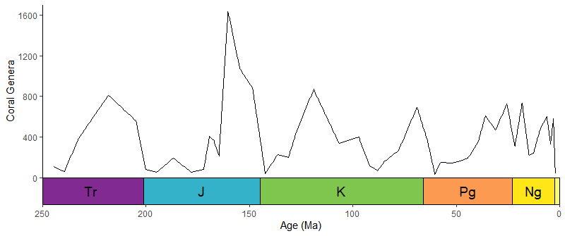
library(gsloid)
ggplot(lisiecki2005) +
  geom_line(aes(x = d18O, y = Time/1000), orientation = "y") +
  scale_y_reverse("Time (Ma)") +
  scale_x_reverse() +
  coord_geo(dat = "Geomagnetic Polarity Chron", xlim = c(6,2), ylim = c(6,0), pos = "left", rot = 90) +
  theme_classic()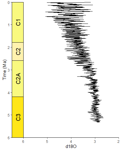
Specify multiple scales by giving a list for pos. Scales
are added from the inside to the outside. Other arguments can be lists
or single values (either of which will be recycled if necessary).
# uses the coral diversity data from above
ggplot(coral_div) +
  geom_line(aes(x = stage_age, y = n)) +
  scale_x_reverse("Age (Ma)") +
  ylab("Coral Genera") +
  coord_geo(dat = list("periods", "eras"), xlim = c(250, 0), ylim = c(0, 1700),
            pos = list("b", "b"), abbrv = list(TRUE, FALSE)) +
  theme_classic()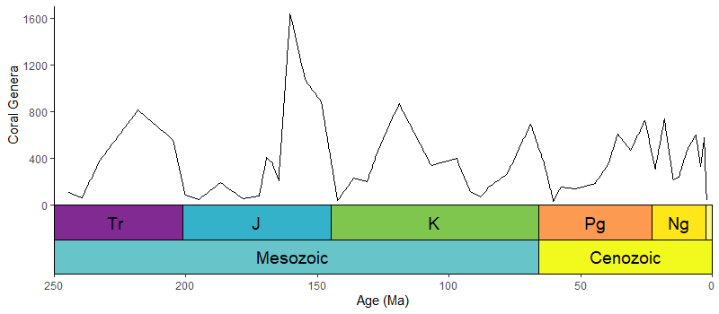
# uses the oxygen isotope data from above
ggplot(lisiecki2005) +
  geom_line(aes(x = d18O, y = Time/1000), orientation = "y") +
  scale_y_reverse("Time (Ma)") +
  scale_x_reverse() +
  coord_geo(dat = list("Geomagnetic Polarity Chron", "Planktic foraminiferal Primary Biozones"),
            xlim = c(6,2), ylim = c(5.5,0), pos = list("l", "r"), rot = 90, skip = "PL4", size = list(5, 4)) +
  theme_classic()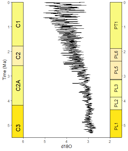
You can change on which facets the time scale is plotted by changing
the scales argument in facet_wrap().
# uses the coral occurrence data from above
coral_div_diet <- corals %>% filter(stage != "") %>%
  group_by(diet, stage) %>%
  summarise(n = n()) %>%
  mutate(stage_age = (stages$max_age[match(stage, stages$name)] + stages$min_age[match(stage, stages$name)])/2)

ggplot(coral_div_diet) +
  geom_line(aes(x = stage_age, y = n)) +
  scale_x_reverse("Age (Ma)") +
  ylab("Coral Genera") +
  coord_geo(xlim = c(250, 0)) +
  theme_classic() +
  facet_wrap(~diet, nrow = 3)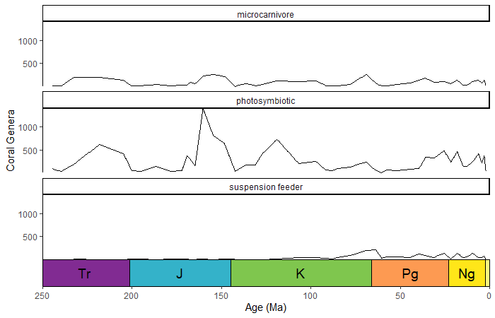
coord_geo() will automatically detect if your axis is
discrete. The categories of the discrete axis (which can be reordered
using the limits argument of
scale_[x/y]_discrete()) should match the name
column of the timescale data (dat). You can use the
arguments of theme() and
scale_[x/y]_discrete() to optionally remove the labels and
tick marks.
# uses the coral occurrence data from above
coral_div_dis <- corals %>% filter(period != "") %>%
  group_by(diet, period) %>%
  summarise(n = n()) %>%
  mutate(period_age = (periods$max_age[match(period, periods$name)] + periods$min_age[match(period, periods$name)])/2) %>%
  arrange(-period_age)

ggplot(coral_div_dis) +
  geom_col(aes(x = period, y = n, fill = diet)) +
  scale_x_discrete("Period", limits = unique(coral_div_dis$period), labels = NULL, expand = expansion(add = .5)) +
  scale_y_continuous(expand = c(0,0)) +
  scale_fill_viridis_d() +
  ylab("Coral Genera") +
  coord_geo(expand = TRUE, skip = NULL, abbrv = FALSE) +
  theme_classic() +
  theme(axis.ticks.length.x = unit(0, "lines"))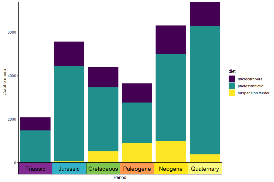
You can also supply your own pre-discretized scale data by setting
the dat_is_discrete parameter to TRUE. You can
even have one scale with auto-discretized ages and one scale with
pre-discretized ages.
eras_custom <- data.frame(name = c("Mesozoic", "Cenozoic"), max_age = c(0.5, 3.5), min_age = c(3.5, 6.5), color = c("#67C5CA", "#F2F91D"))

ggplot(coral_div_dis) +
  geom_col(aes(x = period, y = n, fill = diet)) +
  scale_x_discrete(NULL, limits = unique(coral_div_dis$period), labels = NULL, expand = expansion(add = .5)) +
  scale_y_continuous(expand = c(0,0)) +
  scale_fill_viridis_d() +
  ylab("Coral Genera") +
  coord_geo(dat = list("periods", eras_custom), pos = c("b", "b"), expand = TRUE, skip = NULL, abbrv = FALSE, dat_is_discrete = list(FALSE, TRUE)) +
  theme_classic() +
  theme(axis.ticks.length.x = unit(0, "lines"))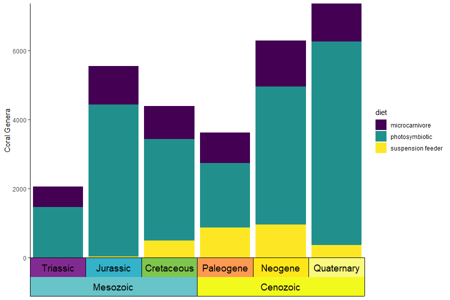
coord_geo() can use the ggfittext package to
resize labels. This can be enabled by setting size to
"auto". Additional arguments can be passed to
geom_fit_text() as a list using the
fittext_args argument.
ggplot(coral_div) +
  geom_line(aes(x = stage_age, y = n)) +
  scale_x_reverse("Age (Ma)") +
  ylab("Coral Genera") +
  coord_geo(dat = "periods", xlim = c(250, 0), ylim = c(0, 1700),
            abbrv = FALSE, size = "auto", fittext_args = list(size = 20)) +
  theme_classic()
library(phytools)
library(ggtree)
data(mammal.tree)
p <- ggtree(mammal.tree) +
  coord_geo(xlim = c(-75,0), ylim = c(-2,Ntip(mammal.tree)), neg = TRUE, abbrv = FALSE) +
  scale_x_continuous(breaks=seq(-80,0,20), labels=abs(seq(-80,0,20))) +
  theme_tree2()
revts(p)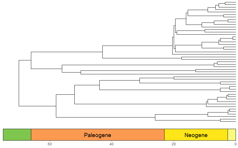
library(phytools)
library(ggtree)
library(paleotree)
data(RaiaCopesRule)
ggtree(ceratopsianTreeRaia, position = position_nudge(x = -ceratopsianTreeRaia$root.time)) +
  coord_geo(xlim = c(-163.5,-66), ylim = c(-2,Ntip(ceratopsianTreeRaia)), pos = list("bottom", "bottom"),
            skip = c("Paleocene", "Middle Jurassic"), dat = list("epochs", "periods"), abbrv = FALSE,
            size = list(4,5), neg = TRUE, center_end_labels = TRUE) +
  scale_x_continuous(breaks = -rev(epochs$max_age), labels = rev(epochs$max_age)) +
  theme_tree2() +
  theme(plot.margin = margin(7,11,7,11))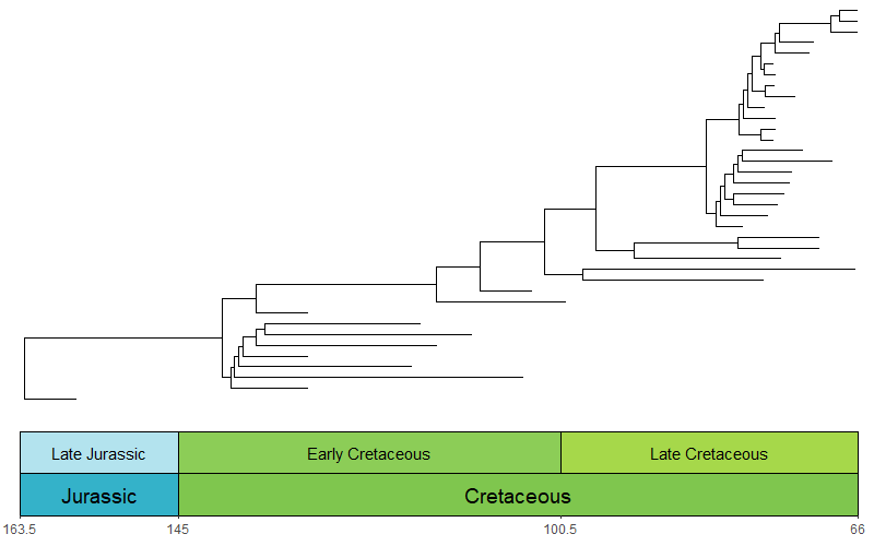
library(paleotree)
data(RaiaCopesRule)
p1 <- ggplot(ammoniteTraitsRaia) +
  geom_point(aes(x = Log_D, y = FD)) +
  labs(x = "Body size", y = "Suture complexity") +
  theme_classic()

p2 <- ggplot(ammoniteTraitsRaia) +
  geom_point(aes(x = Log_D, y = log_dur)) +
  labs(x = "Body size", y = "Stratigraphic duration (myr)") +
  theme_classic()

p3 <- ggtree(ammoniteTreeRaia, position = position_nudge(x = -ammoniteTreeRaia$root.time)) +
  coord_geo(xlim = c(-415,-66), ylim = c(-2,Ntip(ammoniteTreeRaia)), pos = "bottom",
            size = 4, abbrv = FALSE, neg = TRUE) +
  scale_x_continuous(breaks = seq(-425, -50, 25), labels = -seq(-425, -50, 25)) +
  theme_tree2() +
  theme(plot.margin = margin(7,11,7,11))

ggarrange2(ggarrange2(p1, p2, widths = c(2,1), draw = FALSE), p3, nrow = 2, heights = c(1,2))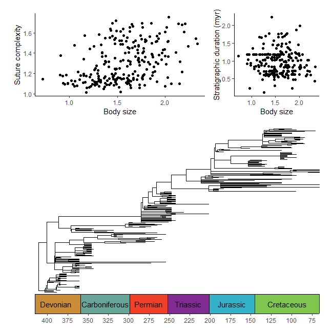
#make transformer
library(ggforce)
trans <- linear_trans(shear(.5, 0))
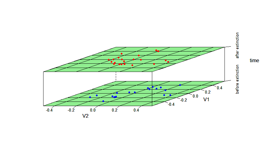
library(dispRity)
data(demo_data)
# prepare data to be plotted
crinoids <- as.data.frame(demo_data$wright$matrix[[1]][, 1:2])
crinoids$time <- "before extinction"
crinoids$time[demo_data$wright$subsets$after$elements] <- "after extinction"
square <- data.frame(V1 = c(-.6, -.6, .6, .6), V2 = c(-.4, .4, .4, -.4))
# plot data normally
ggplot() +
geom_segment(data = data.frame(x = -.6, y = seq(-.4, .4,.2), xend = .6, yend = seq(-0.4, .4, .2)),
aes(x = x, y = y, xend = xend, yend=yend), linetype = "dashed", color = "grey") +
geom_segment(data = data.frame(x = seq(-.6, .6, .2), y = -.4, xend = seq(-.6, .6, .2), yend = .4),
aes(x = x, y = y, xend = xend, yend=yend), linetype = "dashed", color = "grey") +
geom_polygon(data = square, aes(x = V1, y = V2), fill = NA, color = "black") +
geom_point(data = crinoids, aes(x = V1, y = V2), color = 'black') +
coord_cartesian(expand = FALSE) +
labs(x = "PCO1", y = "PCO2") +
theme_classic() +
facet_wrap(~time, ncol = 1, strip.position = "right") +
theme(panel.spacing = unit(1, "lines"), panel.background = element_blank())
# plot data with transformation
ggplot() +
geom_segment(data = data.frame(x = -.6, y = seq(-.4, .4,.2), xend = .6, yend = seq(-0.4, .4, .2)),
aes(x = x, y = y, xend = xend, yend=yend), linetype = "dashed", color = "grey") +
geom_segment(data = data.frame(x = seq(-.6, .6, .2), y = -.4, xend = seq(-.6, .6, .2), yend = .4),
aes(x = x, y = y, xend = xend, yend=yend), linetype = "dashed", color = "grey") +
geom_polygon(data = square, aes(x = V1, y = V2), fill = NA, color = "black") +
geom_point(data = crinoids, aes(x = V1, y = V2), color = 'black') +
coord_trans_xy(trans = trans, expand = FALSE) +
labs(x = "PCO1", y = "PCO2") +
theme_classic() +
facet_wrap(~time, ncol = 1, strip.position = "right") +
theme(panel.spacing = unit(1, "lines"), panel.background = element_blank())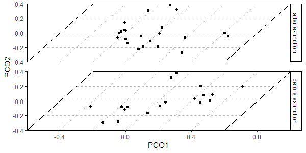
# use same data as above
# plot data
crinoids$time <- factor(crinoids$time)
disparity_through_time(time~V1*V2, data = crinoids, groups = time, aspect = c(1.5,2), xlim = c(-.6,.6), ylim = c(-.5,.5),
                       col.regions = "lightgreen", col.point = c("red","blue"))