The goal of fdistr is to provide an efficient way to create frequency distribution tables and use those tables to generate Pareto charts.
Frequency distribution tables are used to show the frequency of various outcomes in a data set. Each entry in the table contains a frequency or count of the occurrences of values within a particular group or interval, and in this way, the table summarizes the distribution of values in the data set.
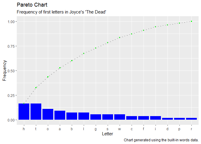
A Pareto chart is a bar graph visually depicts the frequency distribution table.
You can install the released version of fdistr from CRAN with:
And the development version from GitHub with:
What follows is a basic example which shows you how to use the fdistr package with the built-in words dataset.
Start by loading the words dataset. The dataset contains a data frame with four variables about a collection of words taken from the first paragraph of James Joyce’s short story “The Dead.”
library(fdistr)

data(words)

str(words)
#> 'data.frame':    55 obs. of  4 variables:
#>  $ word        : chr  "lily" "the" "caretaker’s" "daughter" ...
#>  $ first_letter: chr  "l" "t" "c" "d" ...
#>  $ last_letter : chr  "y" "e" "s" "r" ...
#>  $ letter_count: int  4 3 11 8 3 9 3 3 3 4 ...
It is possible to create a frequency distribution table with any of the four variables in this table. For this example, pass the first_letter variable to the create_table function and return the table (stored as a data frame) to a variable called table. Use the dec_pos argument to set the number of positions following the decimal to be displayed in the table.
table <- create_table(words$first_letter,
                      dec_pos = 3)

table
#>    group count frequency cumulative_count cumulative_frequency
#> 1      h     9     0.164                9                0.164
#> 2      t     9     0.164               18                0.327
#> 3      o     6     0.109               24                0.436
#> 4      a     5     0.091               29                0.527
#> 5      b     4     0.073               33                0.600
#> 6      l     4     0.073               37                0.673
#> 7      g     3     0.055               40                0.727
#> 8      s     3     0.055               43                0.782
#> 9      w     3     0.055               46                0.836
#> 10     c     2     0.036               48                0.873
#> 11     f     2     0.036               50                0.909
#> 12     i     2     0.036               52                0.945
#> 13     d     1     0.018               53                0.964
#> 14     p     1     0.018               54                0.982
#> 15     r     1     0.018               55                1.000
In this case, the frequency distribution table provides a row for each unique first letter in the dataset, arranged in descending order of count, with the frequency, cumulative count and cumulative frequency for each first letter.
To plot the data in a Pareto chart, pass the table data frame to the create_pareto function along with character strings for the plot labels.
create_pareto(table,
              title = "Pareto Chart",
              subtitle = "Frequency of first letters in Joyce's 'The Dead'",
              x_label = "Letter",
              y_label = "Frequency",
              caption = "Chart generated using the built-in words data.")