![]()
Readable, complete and pretty graphs for correspondence analysis made with FactoMineR. Many can be rendered as interactive html plots, showing useful informations at mouse hover. The interest is not mainly visual but statistical : it helps the reader to keep in mind the data contained in the cross-table or Burt table while reading correspondence analysis, thus preventing overinterpretation. Graphs are made with ggplot2, which means that you can use the + syntax to manually add as many graphical pieces you want, or change theme elements.
You can install ggfacto from CRAN:
Or install the development version from github:
Make the MCA with FactoMineR :
library(ggfacto)
data(tea, package = "FactoMineR")
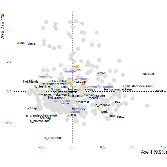
res.mca <- FactoMineR::MCA(tea, quanti.sup = 19, quali.sup = c(20:36), graph = FALSE)Make the plot (as a ggplot2 object) :
Turn the plot interactive :
 If you don’t want interactive usage, you can use
 text_repel = TRUE to avoid overlapping of text and obtain a more readable image (be careful that, if the plot is overloaded, labels can be far away from their original location) :
ggmca(res.mca, sup_vars = "SPC", ylim = c(NA, 1.2), ellipses = 0.95, text_repel = TRUE, size_scale_max = 4)
ggmca(res.mca, sup_vars = "SPC", ylim = c(NA, 1.2), type = "facets", ellipses = 0.5, size_scale_max = 4)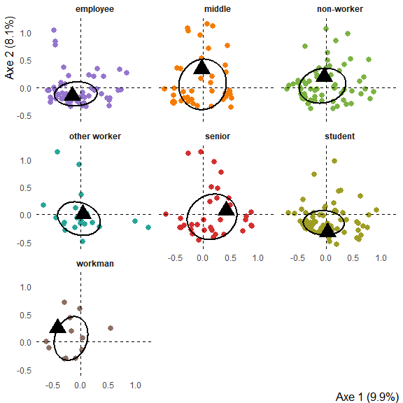
Make the correspondence analysis :
tabs <- tabxplor::tab_plain(forcats::gss_cat, race, marital, df = TRUE)
res.ca <- FactoMineR::CA(tabs, graph = FALSE)
Interactive plot :
graph.ca <- ggca(res.ca,
                 title = "Race by marical : correspondence analysis",
                 tooltips = c("row", "col"))
ggi(graph.ca)
Image plot (with text_repel to avoid overlapping of labels) :
ggca(res.ca,
     title = "Race by marical : correspondence analysis",
     text_repel = TRUE, dist_labels = 0.02)
Step-by-step functions can be used to create a database with all the necessary data, modify it, then use it to draw the plot :
library(dplyr)
library(ggplot2)

plot_data <- ggmca_data(res.mca, sup_vars = "SPC")

plot_data$sup_vars_coord <- plot_data$sup_vars_coord %>%
  filter(!lvs %in% c("other worker", "non-worker"))

ggmca_plot(plot_data, ylim = c(NA, 1.2), text_repel = TRUE, size_scale_max = 4)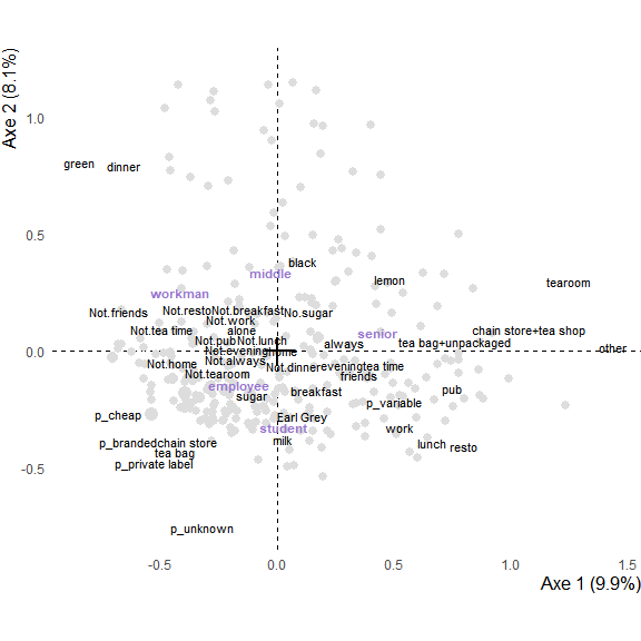
The plot can always be modified using the ggplot2 + operator :
ggmca_plot(plot_data, ylim = c(NA, 1.2), size_scale_max = 4) +
labs(title = "Multiple correspondence analysis") +
theme(axis.line = element_line(linetype = "solid") )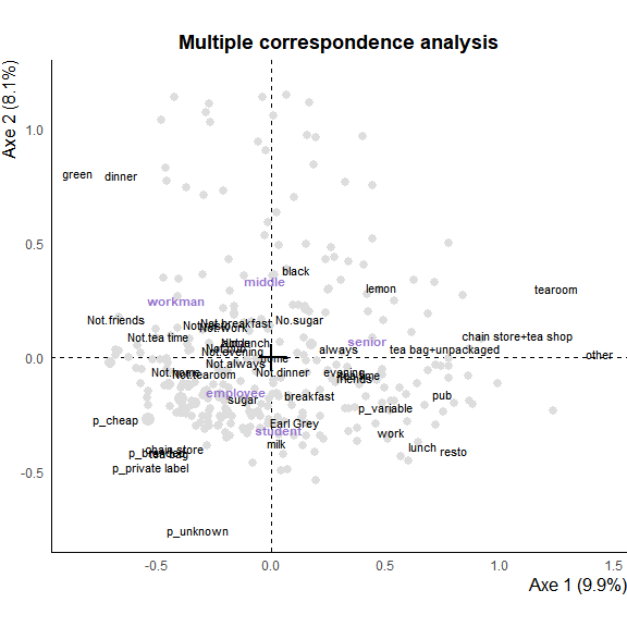 You can then pass to plot to
 ggi() to make it interactive
You can also set use_theme = FALSE to use you own ggplot2 theme :
