

Taking your models to new heights
modelbased is a package helping with model-based
estimations, to easily compute of marginal means, contrast analysis and
model predictions.
The modelbased package is available on CRAN, while its latest development version is available on R-universe (from rOpenSci).
| Type | Source | Command |
|---|---|---|
| Release | CRAN | install.packages("modelbased") |
| Development | R-universe | install.packages("modelbased", repos = "https://easystats.r-universe.dev") |
Once you have downloaded the package, you can then load it using:
library("modelbased")Click on the buttons above to access the package documentation and the easystats blog, and check-out these vignettes:
The package is built around 5 main functions:
estimate_means():
Estimates the average values at each factor levelsestimate_contrasts():
Estimates and tests contrasts between different factor levelsestimate_slopes():
Estimates the slopes of numeric predictors at different factor levels or
alongside a numeric predictorestimate_response():
Predict the response variable using the modelThese functions are powered by the visualisation_matrix()
function, a smart tool for guessing the appropriate reference grid.
ggplot.Check-out this vignette for a detailed walkthrough on visualisation matrices.
library(ggplot2)
library(see)
library(modelbased)

# 1. Fit model and get visualization matrix
model <- lm(Sepal.Length ~ Petal.Length * Petal.Width, data = iris)

# 2. Create a visualisation matrix with expected Z-score values of Petal.Width
vizdata <- modelbased::visualisation_matrix(model, at = c("Petal.Length", "Petal.Width = c(-1, 0, 1)"))

# 3. Revert from expected SD to actual values
vizdata <- unstandardize(vizdata, select = "Petal.Width")

# 4. Add predicted relationship from the model
vizdata <- modelbased::estimate_expectation(vizdata)

# 5. Express Petal.Width as z-score ("-1 SD", "+2 SD", etc.)
vizdata$Petal.Width <- effectsize::format_standardize(vizdata$Petal.Width, reference = iris$Petal.Width)

# 6. Plot
ggplot(iris, aes(x = Petal.Length, y = Sepal.Length)) +
  # Add points from original dataset (only shapes 21-25 have a fill aesthetic)
  geom_point2(aes(fill = Petal.Width), shape = 21, size = 5) +
  # Add relationship lines
  geom_line(data = vizdata, aes(y = Predicted, color = Petal.Width), size = 1) +
  # Improve colors / themes
  scale_color_viridis_d(direction = -1) +
  scale_fill_viridis_c(guide = "none") +
  theme_modern()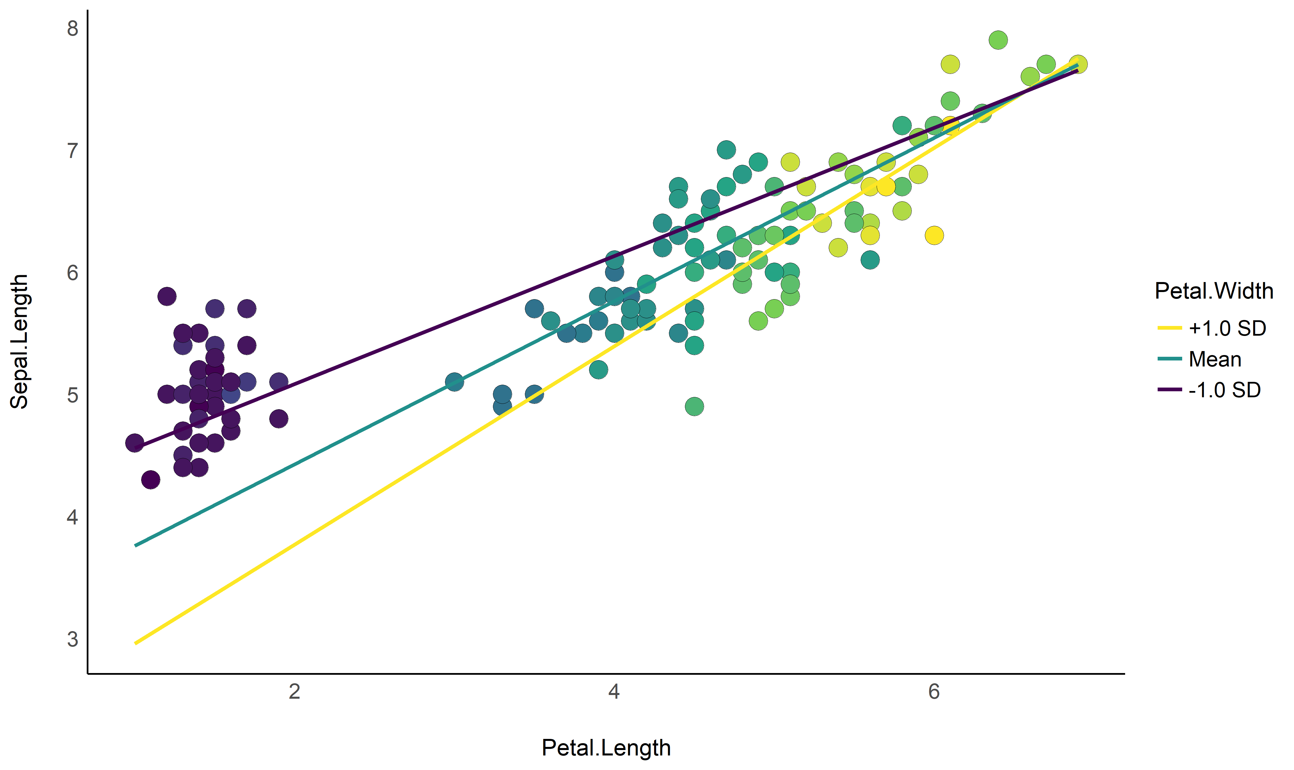
Check-out this vignette for a detailed walkthrough on marginal means.
# 1. The model
model <- lm(Sepal.Width ~ Species, data = iris)

# 2. Obtain estimated means
means <- estimate_means(model)
means
## Estimated Marginal Means
##
## Species    | Mean |   SE |       95% CI
## ---------------------------------------
## setosa     | 3.43 | 0.05 | [3.33, 3.52]
## versicolor | 2.77 | 0.05 | [2.68, 2.86]
## virginica  | 2.97 | 0.05 | [2.88, 3.07]
##
## Marginal means estimated at Species

# 3. Plot
ggplot(iris, aes(x = Species, y = Sepal.Width)) +
  # Add base data
  geom_violin(aes(fill = Species), color = "white") +
  geom_jitter2(width = 0.05, alpha = 0.5) +

  # Add pointrange and line from means
  geom_line(data = means, aes(y = Mean, group = 1), size = 1) +
  geom_pointrange(
    data = means,
    aes(y = Mean, ymin = CI_low, ymax = CI_high),
    size = 1,
    color = "white"
  ) +
  # Improve colors
  scale_fill_material() +
  theme_modern()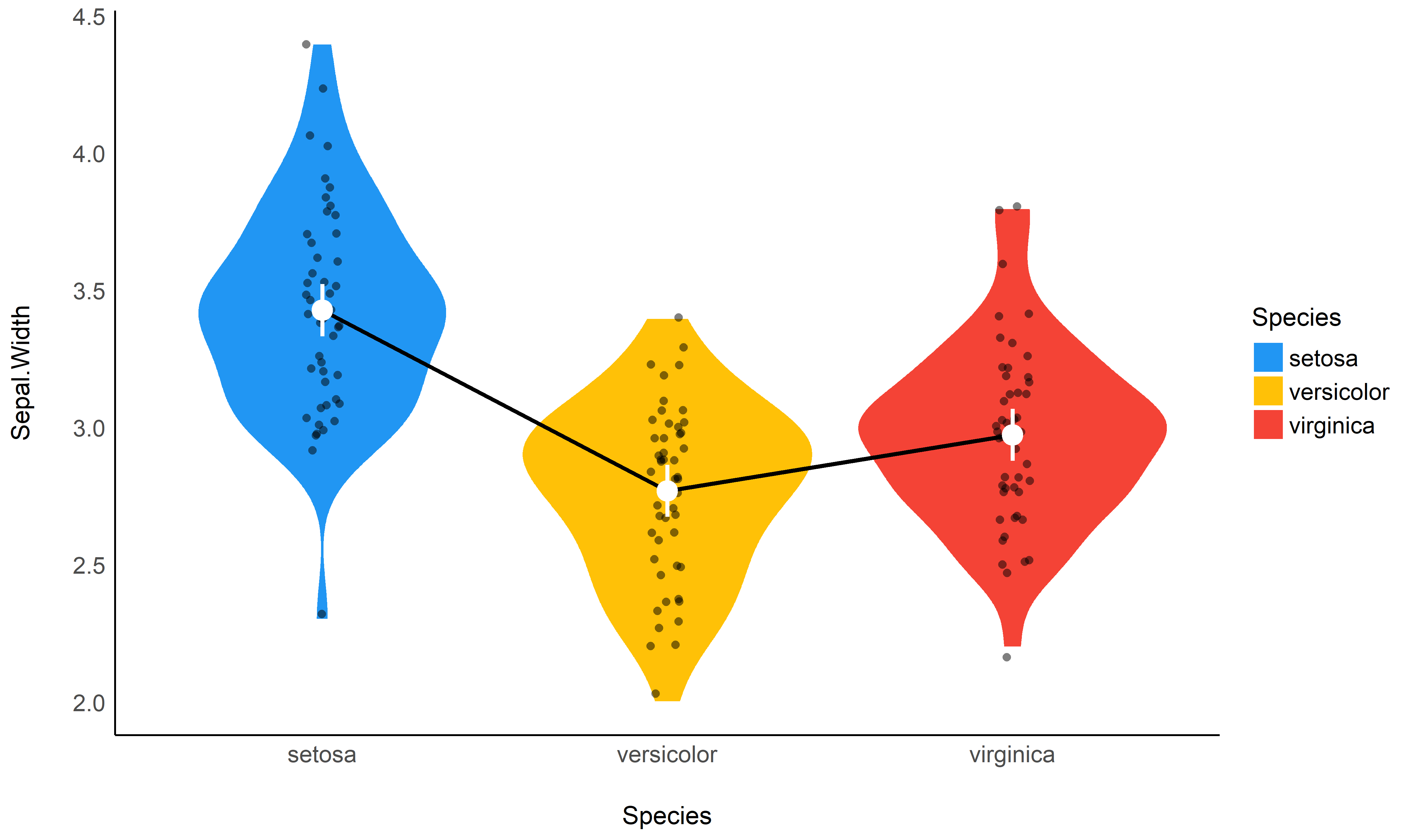
Check-out this vignette for a detailed walkthrough on contrast analysis.
# 1. The model
model <- lm(Sepal.Width ~ Species, data = iris)

# 2. Estimate marginal contrasts
contrasts <- estimate_contrasts(model)
contrasts
## Marginal Contrasts Analysis
##
## Level1     |     Level2 | Difference |         95% CI |   SE | t(147) |      p
## ------------------------------------------------------------------------------
## setosa     | versicolor |       0.66 | [ 0.49,  0.82] | 0.07 |   9.69 | < .001
## setosa     |  virginica |       0.45 | [ 0.29,  0.62] | 0.07 |   6.68 | < .001
## versicolor |  virginica |      -0.20 | [-0.37, -0.04] | 0.07 |  -3.00 | 0.009
##
## Marginal contrasts estimated at Species
## p-value adjustment method: Holm (1979)
model <- lm(Sepal.Width ~ Species * Petal.Length, data = iris)

estimate_contrasts(model, at = "Petal.Length", length = 3)
## Marginal Contrasts Analysis
##
## Level1     |     Level2 | Petal.Length | Difference |        95% CI |   SE | t(144) |      p
## --------------------------------------------------------------------------------------------
## setosa     | versicolor |         1.00 |       1.70 | [ 0.87, 2.53] | 0.34 |   4.97 | < .001
## setosa     | versicolor |         3.95 |       1.74 | [ 0.16, 3.32] | 0.65 |   2.67 | 0.023
## setosa     | versicolor |         6.90 |       1.78 | [-1.71, 5.26] | 1.44 |   1.24 | 0.434
## setosa     |  virginica |         1.00 |       1.34 | [ 0.38, 2.30] | 0.40 |   3.38 | 0.003
## setosa     |  virginica |         3.95 |       1.79 | [ 0.19, 3.40] | 0.66 |   2.70 | 0.021
## setosa     |  virginica |         6.90 |       2.25 | [-1.19, 5.69] | 1.42 |   1.58 | 0.257
## versicolor |  virginica |         1.00 |      -0.36 | [-1.55, 0.83] | 0.49 |  -0.73 | 0.747
## versicolor |  virginica |         3.95 |       0.06 | [-0.30, 0.42] | 0.15 |   0.37 | 0.926
## versicolor |  virginica |         6.90 |       0.47 | [-0.22, 1.16] | 0.28 |   1.65 | 0.229
##
## Marginal contrasts estimated at Species
## p-value adjustment method: Holm (1979)
# Recompute contrasts with a higher precision (for a smoother plot)
contrasts <- estimate_contrasts(model, at = "Petal.Length", length = 20)
# Add Contrast column by concatenating
contrasts$Contrast <- paste(contrasts$Level1, "-", contrasts$Level2)
# Plot
ggplot(contrasts, aes(x = Petal.Length, y = Difference, )) +
# Add line and CI band
geom_line(aes(color = Contrast)) +
geom_ribbon(aes(ymin = CI_low, ymax = CI_high, fill = Contrast), alpha = 0.2) +
# Add line at 0, indicating no difference
geom_hline(yintercept = 0, linetype = "dashed") +
# Colors
theme_modern()
Check-out this vignette for a detailed walkthrough on predictions.
# Fit model 1 and predict the response variable
model1 <- lm(Petal.Length ~ Sepal.Length, data = iris)
pred1 <- estimate_response(model1)
pred1$Petal.Length <- iris$Petal.Length # Add true response

# Print first 5 lines of output
head(pred1, n = 5)
## Model-based Expectation
##
## Petal.Length | Sepal.Length | Predicted |   SE |       95% CI | Residuals
## -------------------------------------------------------------------------
## 1.40         |         5.10 |      2.38 | 0.10 | [2.19, 2.57] |     -0.98
## 1.40         |         4.90 |      2.00 | 0.11 | [1.79, 2.22] |     -0.60
## 1.30         |         4.70 |      1.63 | 0.12 | [1.39, 1.87] |     -0.33
## 1.50         |         4.60 |      1.45 | 0.13 | [1.19, 1.70] |      0.05
## 1.40         |         5.00 |      2.19 | 0.10 | [1.99, 2.39] |     -0.79
##
## Variable predicted: Petal.Length

# Same for model 2
model2 <- lm(Petal.Length ~ Sepal.Length * Species, data = iris)
pred2 <- estimate_response(model2)
pred2$Petal.Length <- iris$Petal.Length


# Initialize plot for model 1
ggplot(data = pred1, aes(x = Petal.Length, y = Predicted)) +
  # with identity line (diagonal) representing perfect predictions
  geom_abline(linetype = "dashed") +
  # Add the actual predicted points of the models
  geom_point(aes(color = "Model 1")) +
  geom_point(data = pred2, aes(color = "Model 2")) +
  # Aesthetics changes
  labs(y = "Petal.Length (predicted)", color = NULL) +
  scale_color_manual(values = c("Model 1" = "blue", "Model 2" = "red")) +
  theme_modern()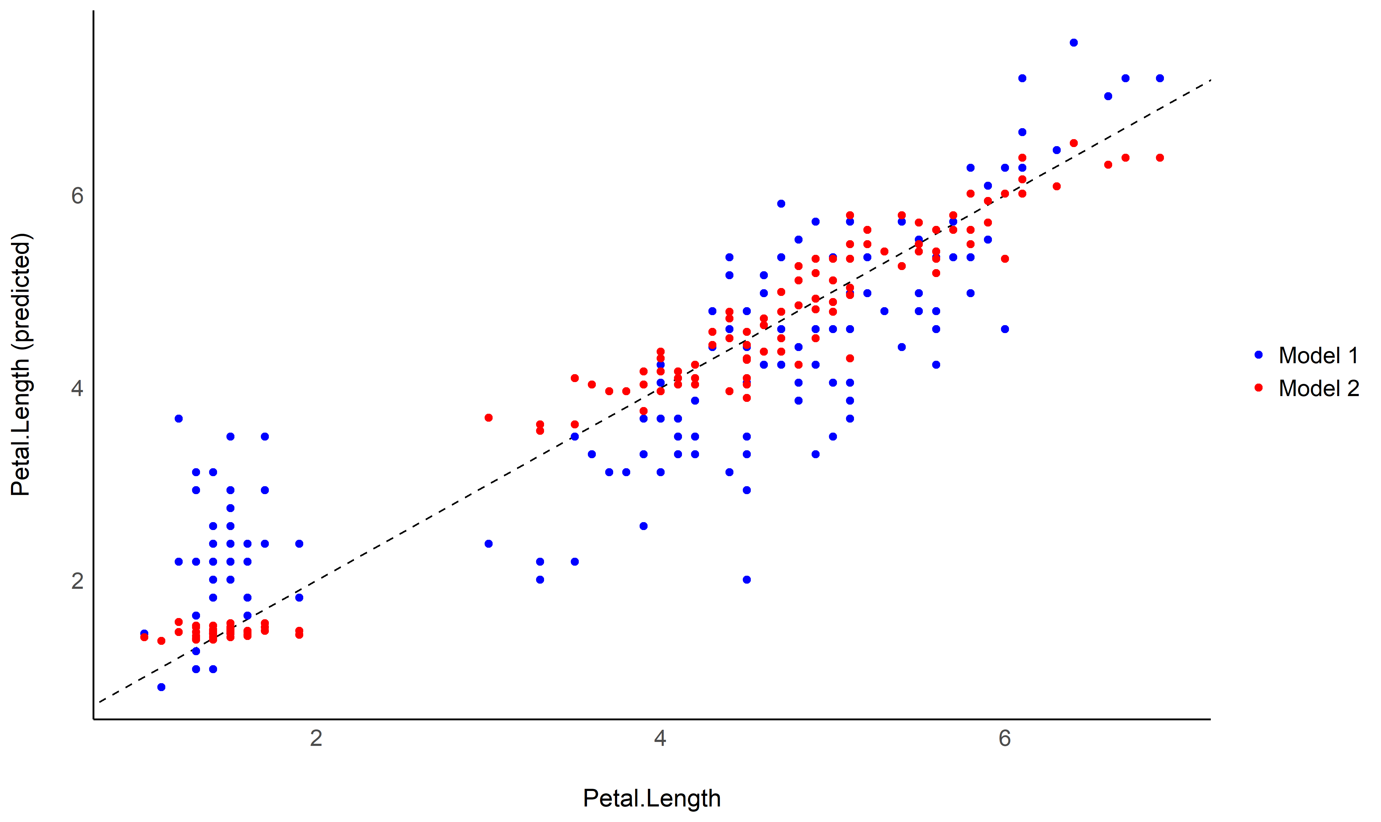
estimate_grouplevel on a mixed model.See this vignette for more information.
library(lme4)

model <- lmer(mpg ~ drat + (1 + drat | cyl), data = mtcars)

random <- estimate_grouplevel(model)
random
## Group | Level |   Parameter | Coefficient |   SE |         95% CI
## -----------------------------------------------------------------
## cyl   |     4 | (Intercept) |       -3.45 | 0.56 | [-4.55, -2.36]
## cyl   |     4 |        drat |        2.24 | 0.36 | [ 1.53,  2.95]
## cyl   |     6 | (Intercept) |        0.13 | 0.84 | [-1.52,  1.78]
## cyl   |     6 |        drat |       -0.09 | 0.54 | [-1.15,  0.98]
## cyl   |     8 | (Intercept) |        3.32 | 0.73 | [ 1.89,  4.74]
## cyl   |     8 |        drat |       -2.15 | 0.47 | [-3.07, -1.23]

plot(random)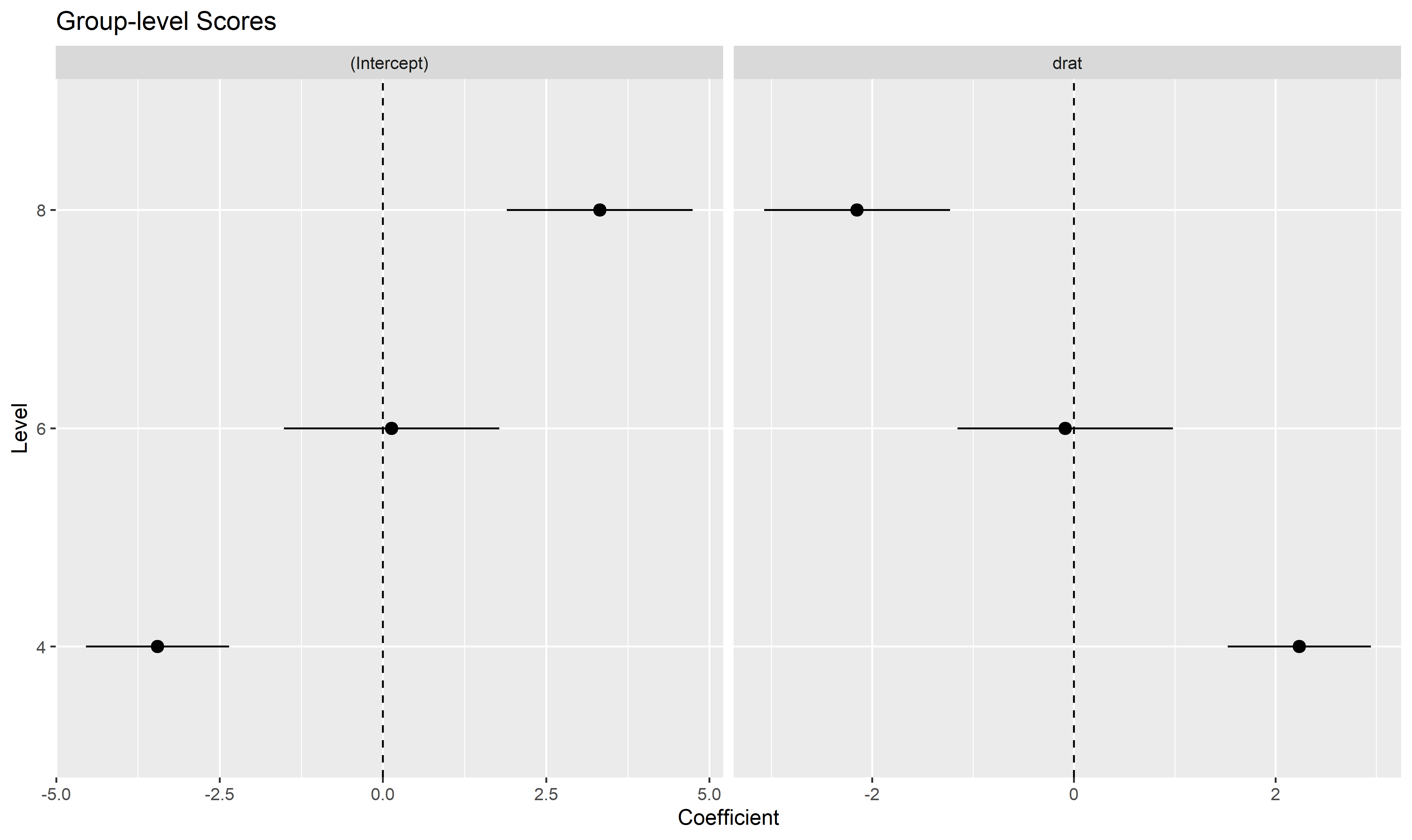
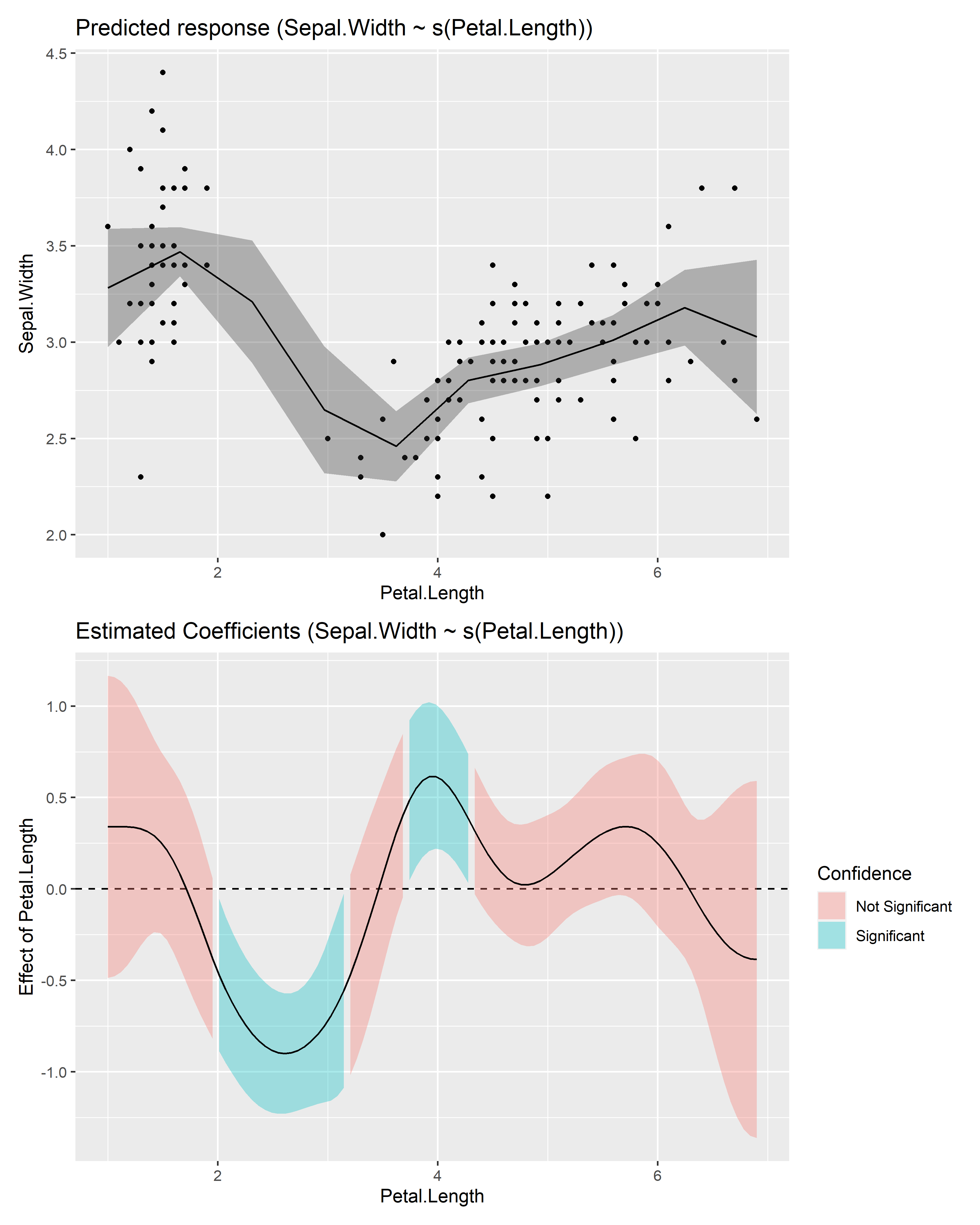
estimate_slopes.The two plots below represent the modeled (non-linear) effect estimated by the model, i.e., the relationship between the outcome and the predictor, as well as the “trend” (or slope) of that relationship at any given point. You can see that whenever the slope is negative, the effect is below 0, and vice versa, with some regions of the effect being significant (i.e., positive or negative with enough confidence) while the others denote regions where the relationship is rather flat.
Check-out this vignette for a detailed walkthrough on marginal effects.
# Fit a non-linear General Additive Model (GAM)
model <- mgcv::gam(Sepal.Width ~ s(Petal.Length), data = iris)

# 1. Compute derivatives
deriv <- estimate_slopes(model,
  trend = "Petal.Length",
  at = "Petal.Length",
  length = 100
)

# 2. Visualize predictions and derivative
see::plots(
  plot(estimate_relation(model)),
  plot(deriv),
  n_rows = 2
)
describe_nonlinear on a predicted relationship that will
return the different parts of increase and decrease.See this vignette for more information.
model <- lm(Sepal.Width ~ poly(Petal.Length, 2), data = iris)

# 1. Visualize
vizdata <- estimate_relation(model, length = 30)

ggplot(vizdata, aes(x = Petal.Length, y = Predicted)) +
  geom_ribbon(aes(ymin = CI_low, ymax = CI_high), alpha = 0.3) +
  geom_line() +
  # Add original data points
  geom_point(data = iris, aes(x = Petal.Length, y = Sepal.Width)) +
  # Aesthetics
  theme_modern()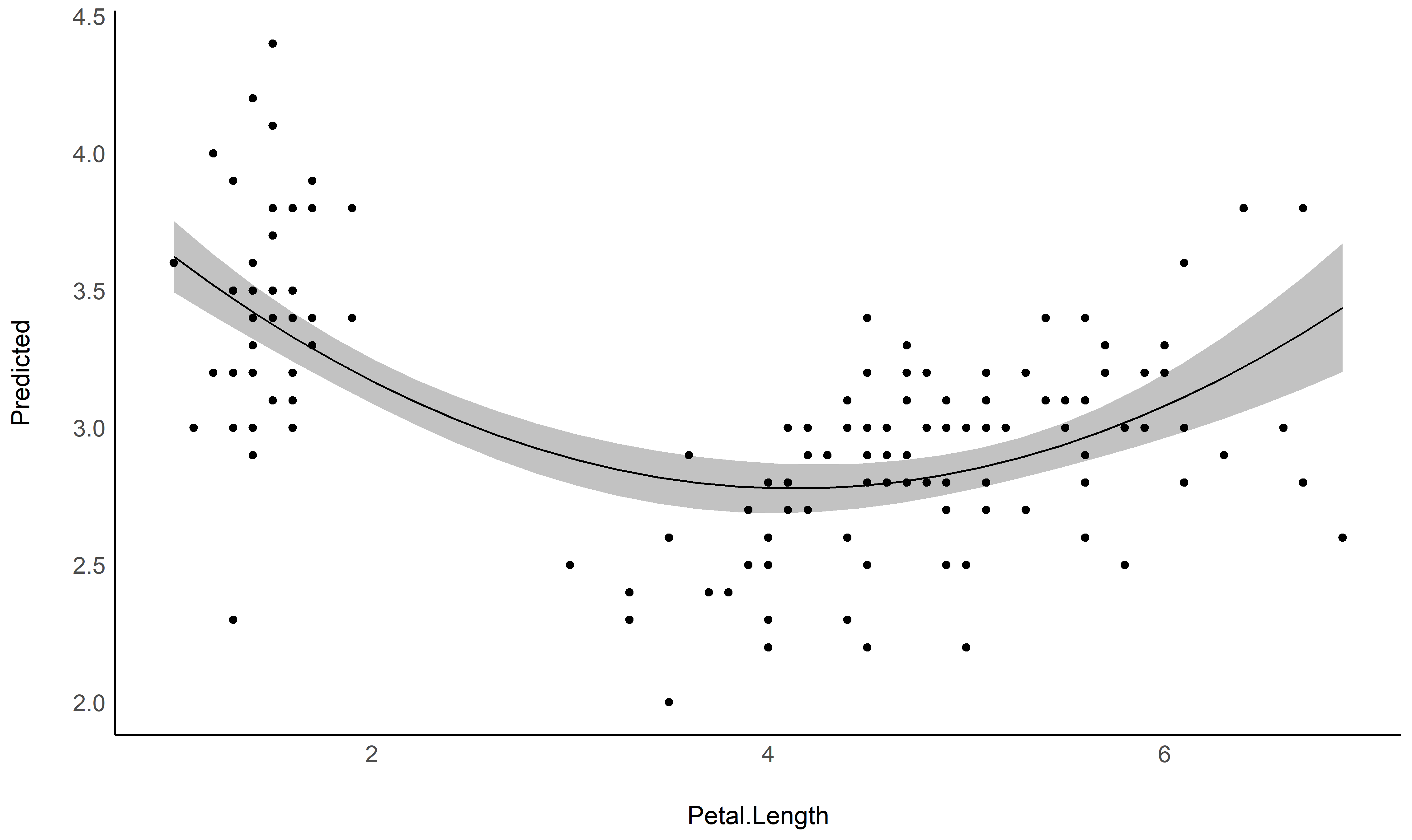
# 2. Describe smooth line
describe_nonlinear(vizdata, x = "Petal.Length")
## Start |  End | Length | Change | Slope |   R2
## ---------------------------------------------
## 1.00  | 4.05 |   0.50 |  -0.84 | -0.28 | 0.05
## 4.05 | 6.90 | 0.47 | 0.66 | 0.23 | 0.05See this vignette for a walkthrough on how to do that.

Also referred to as Johnson-Neyman intervals, this plot shows how the effect (the “slope”) of one variable varies depending on another variable. It is useful in the case of complex interactions between continuous variables.
For instance, the plot below shows that the effect of hp
(the y-axis) is significantly negative only when wt is low
(< ~4).
model <- lm(mpg ~ hp * wt, data = mtcars)

slopes <- estimate_slopes(model, trend = "hp", at = "wt")

plot(slopes)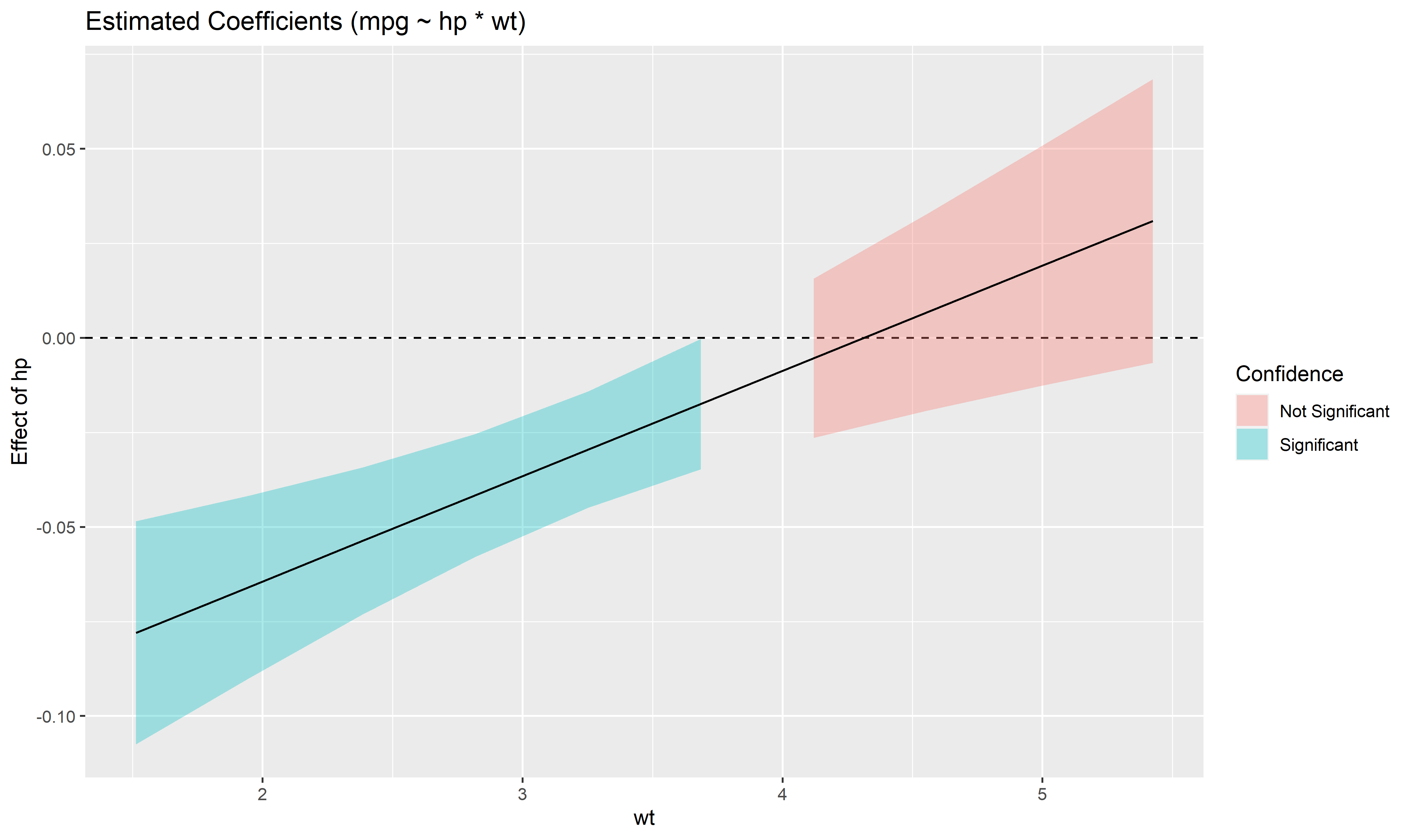
Aside from plotting the coefficient of each random effect (as done here),
we can also visualize the predictions of the model for each of these
levels, which can be useful to diagnostic or see how they contribute to
the fixed effects. We will do that by making predictions with
estimate_relation and setting include_random
to TRUE.
Let’s model the reaction time with the number of days of sleep deprivation as fixed effect and the participants as random intercept.
library(lme4)

model <- lmer(Reaction ~ Days + (1 | Subject), data = sleepstudy)

preds <- estimate_relation(model, include_random = TRUE)

plot(preds, ribbon = list(alpha = 0)) # Make CI ribbon transparent for clarity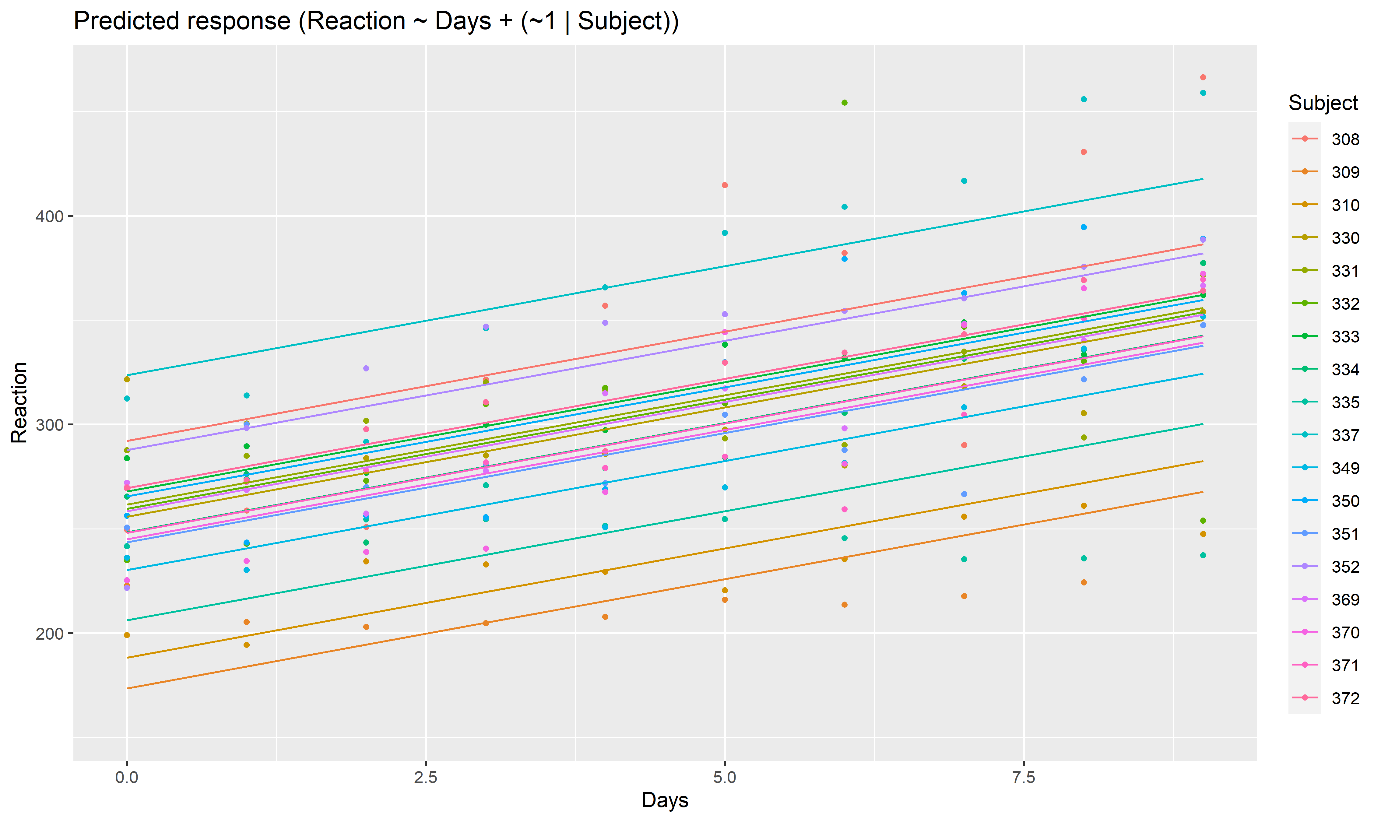
As we can see, each participant has a different “intercept” (starting point on the y-axis), but all their slopes are the same: this is because the only slope is the “general” one estimated across all participants by the fixed effect. Let’s address that and allow the slope to vary for each participant too.
model <- lmer(Reaction ~ Days + (1 + Days | Subject), data = sleepstudy)

preds <- estimate_relation(model, include_random = TRUE)

plot(preds, ribbon = list(alpha = 0.1))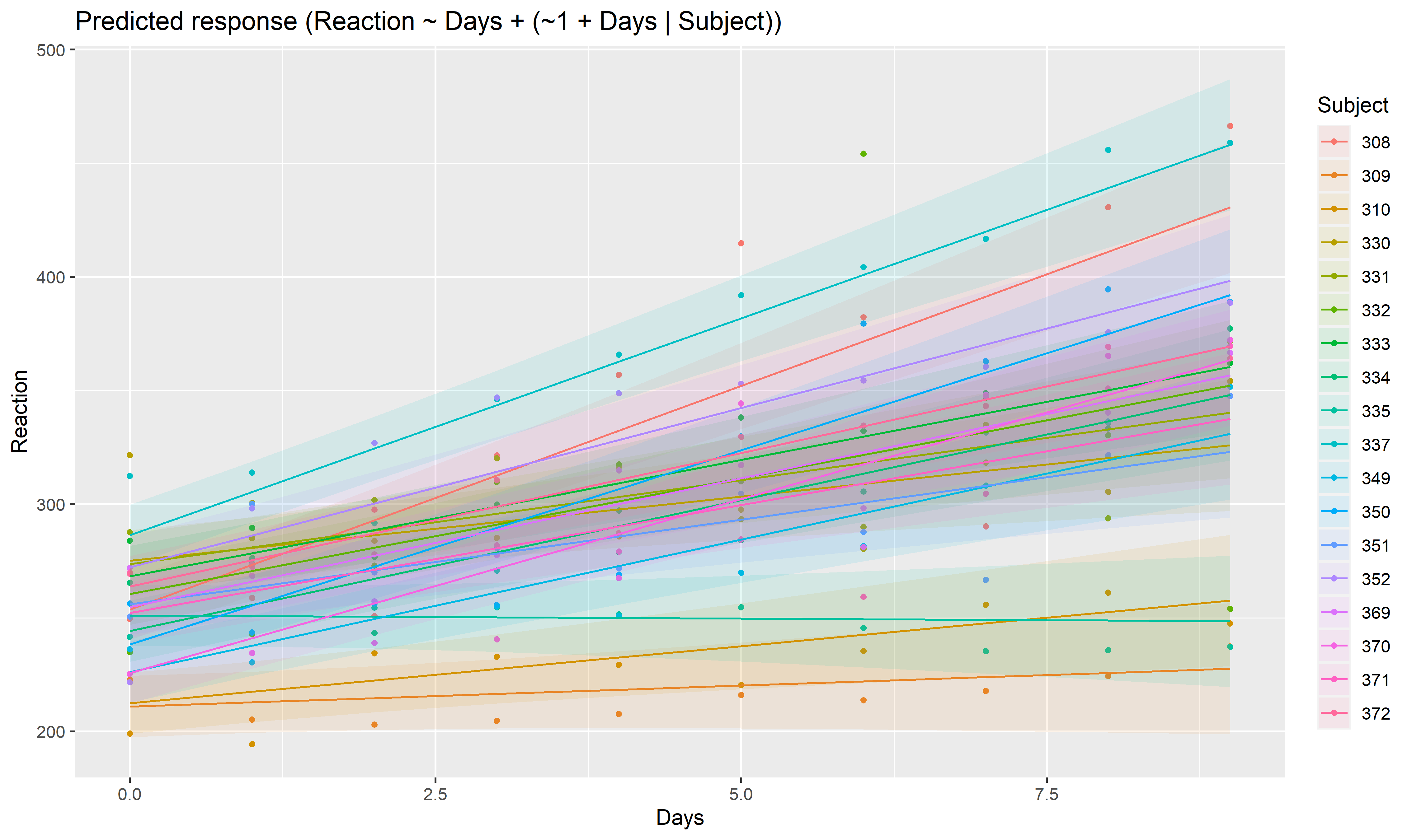
As we can see, the effect is now different for all participants. Let’s plot, on top of that, the “fixed” effect estimated across all these individual effects.
fixed_pred <- estimate_relation(model) # This time, include_random is FALSE (default)

plot(preds, ribbon = list(alpha = 0)) + # Previous plot
  geom_ribbon(data = fixed_pred, aes(x = Days, ymin = CI_low, ymax = CI_high), alpha = 0.4) +
  geom_line(data = fixed_pred, aes(x = Days, y = Predicted), size = 2)
Please note that the modelbased project is released with a Contributor Code of Conduct. By contributing to this project, you agree to abide by its terms.