The muHVT package is a collection of R functions for vector quantization and construction of hierarchical Voronoi tessellations as a data visualization tool to visualize cells using quantization. The hierarchical cells are computed using Hierarchical K-means where a quantization threshold governs the levels in the hierarchy for a set \(k\) parameter (the maximum number of cells at each level). The package is particularly helpful to visualize rich multivariate data.
This package additionally provides functions for computing the Sammon’s projection and plotting the heat map of the variables on the tiles of the tessellations.
The muHVT process involves three steps:
This package can perform vector quantization using the following algorithms -
The second and third steps are iterated until a predefined number of iterations is reached or the clusters converge. The runtime for the algorithm is O(n).
The second and third steps are iterated until a predefined number of iterations is reached or the clusters converge. The runtime for the algorithm is O(k * (n-k)^2) .
The algorithm divides the dataset recursively into cells using \(k-means\) or \(k-medoids\) algorithm. The maximum number of subsets are decided by setting \(nclust\) to, say five, in order to divide the dataset into maximum of five subsets. These five subsets are further divided into five subsets(or less), resulting in a total of twenty five (5*5) subsets. The recursion terminates when the cells either contain less than three data point or a stop criterion is reached. In this case, the stop criterion is set to when the cell error exceeds the quantization threshold.
The steps for this method are as follows :
The stop criterion is when the quantization error of a cell satisfies one of the below conditions
The quantization error for a cell is defined as follows :
\[QE = \max_i(||A-F_i||_{p})\]
where
Let us try to understand quantization error with an example.
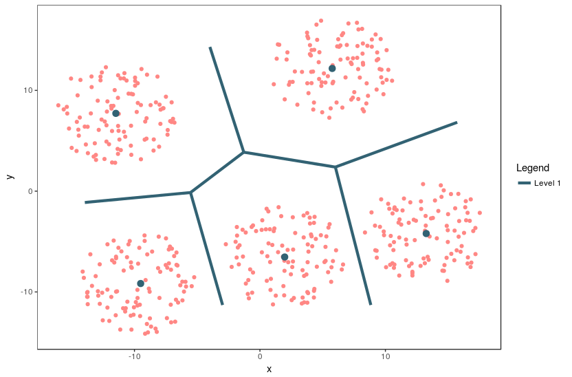
Figure 1: The Voronoi tessellation for level 1 shown for the 5 cells with the points overlayed
An example of a 2 dimensional VQ is shown above.
In the above image, we can see 5 cells with each cell containing a certain number of points. The centroid for each cell is shown in blue. These centroids are also known as codewords since they represent all the points in that cell. The set of all codewords is called a codebook.
Now we want to calculate quantization error for each cell. For the sake of simplicity, let’s consider only one cell having centroid A and m data points F_i for calculating quantization error.
For each point, we calculate the distance between the point and the centroid.
In the above equation, p = 1 means L1_Norm distance whereas p = 2 means L2_Norm distance. In the package, the L1_Norm distance is chosen by default. The user can pass either L1_Norm, L2_Norm or a custom function to calculate the distance between two points in n dimensions.
Now, we take the maximum calculated distance of all m points. This gives us the furthest distance of a point in the cell from the centroid, which we refer to as Quantization Error. If the Quantization Error is higher than the given threshold, the centroid/codevector is not a good representation for the points in the cell. Now we can perform further Vector Quantization on these points and repeat the above steps.
Please note that the user can select mean, max or any custom function to calculate the Quantization Error. The custom function takes a vector of m value (where each value is a distance between point in n dimensions and centroids) and returns a single value which is the Quantization Error for the cell.
If we select mean as the error metric, the above Quantization Error equation will look like this :
A Voronoi diagram is a way of dividing space into a number of regions. A set of points (called seeds, sites, or generators) is specified beforehand and for each seed, there will be a corresponding region consisting of all points within proximity of that seed. These regions are called Voronoi cells. It is complementary to Delaunay triangulation.
Sammon’s projection is an algorithm that maps a high-dimensional space to a space of lower dimensionality while attempting to preserve the structure of inter-point distances in the projection. It is particularly suited for use in exploratory data analysis and is usually considered a non-linear approach since the mapping cannot be represented as a linear combination of the original variables. The centroids are plotted in 2D after performing Sammon’s projection at every level of the tessellation.
Denoting the distance between i^{th} and j^{th} objects in the original space by d_{ij}^, and the distance between their projections by d_{ij}. Sammon’s mapping aims to minimize the below error function, which is often referred to as Sammon’s stress or Sammon’s error
The minimization of this can be performed either by gradient descent, as proposed initially, or by other means, usually involving iterative methods. The number of iterations need to be experimentally determined and convergent solutions are not always guaranteed. Many implementations prefer to use the first Principal Components as a starting configuration.
In this package, we use sammons from the package MASS to project higher dimensional data to a 2D space. The function hvq called from the HVT function returns hierarchical quantized data which will be the input for construction of the tessellations. The data is then represented in 2D coordinates and the tessellations are plotted using these coordinates as centroids. We use the package deldir for this purpose. The deldir package computes the Delaunay triangulation (and hence the Dirichlet or Voronoi tessellation) of a planar point set according to the second (iterative) algorithm of Lee and Schacter. For subsequent levels, transformation is performed on the 2D coordinates to get all the points within its parent tile. Tessellations are plotted using these transformed points as centroids. The lines in the tessellations are chopped in places so that they do not protrude outside the parent polygon. This is done for all the subsequent levels.
In this section, we will use the Prices of Personal Computers dataset. This dataset contains 6259 observations and 10 features. The dataset observes the price from 1993 to 1995 of 486 personal computers in the US. The variables are price, speed, ram, screen, cd,etc. The dataset can be downloaded from here
In this example, we will compress this dataset by using hierarchical VQ using k-means and visualize the Voronoi tessellation plots using Sammons projection. Later on, we will overlay price,speed and screen variable as heatmap to generate further insights.
Here, we load the data and store into a variable computers.
set.seed(240)
# Load data from csv files
computers <- read.csv("https://raw.githubusercontent.com/SangeetM/dataset/master/Computers.csv")
Let’s have a look at sample of the data
| X | price | speed | hd | ram | screen | cd | multi | premium | ads | trend |
|---|---|---|---|---|---|---|---|---|---|---|
| 1 | 1499 | 25 | 80 | 4 | 14 | no | no | yes | 94 | 1 |
| 2 | 1795 | 33 | 85 | 2 | 14 | no | no | yes | 94 | 1 |
| 3 | 1595 | 25 | 170 | 4 | 15 | no | no | yes | 94 | 1 |
| 4 | 1849 | 25 | 170 | 8 | 14 | no | no | no | 94 | 1 |
| 5 | 3295 | 33 | 340 | 16 | 14 | no | no | yes | 94 | 1 |
| 6 | 3695 | 66 | 340 | 16 | 14 | no | no | yes | 94 | 1 |
Now let us check the structure of the data
Let’s get a summary of the data
Let us first split the data into train and test. We will use 80% of the data as train and remaining as test.
# Making train & test split
noOfPoints <- dim(computers)[1]
trainLength <- as.integer(noOfPoints * 0.8)

trainComputers <- computers[1:trainLength,]
testComputers <- computers[(trainLength+1):noOfPoints,]
K-means in not suitable for factor variables as the sample space for factor variables is discrete. A Euclidean distance function on such a space isn’t really meaningful. Hence we will delete the factor variables in our dataset.
Here we keep the original trainComputers and testComputers as we will use price variable from this dataset to overlay as heatmap and generate some insights.
# Removing unwanted columns
trainComputers <- trainComputers %>% dplyr::select(-c(X,cd,multi,premium,trend))
testComputers <- testComputers %>% dplyr::select(-c(X,cd,multi,premium,trend))
Let us try to understand HVT function first.
HVT(
  dataset,
  nclust,
  depth,
  quant.err,
  projection.scale,
  normalize = T,
  distance_metric = c("L1_Norm", "L2_Norm"),
  error_metric = c("mean", "max"),
  quant_method = c("kmeans", "kmedoids"),
  diagnose = TRUE,
  hvt_validation = FALSE,
  train_validation_split_ratio = 0.8
)
Each of the parameters have been explained below
dataset - A dataframe with numeric columns
nlcust - An integer indicating the number of cells per hierarchy (level)
depth - An integer indicating the number of levels. (1 = No hierarchy, 2 = 2 levels, etc …)
quant.error - A number indicating the quantization error threshold. A cell will only breakdown into further cells if the quantization error of the cell is above the defined quantization error threshold
projection.scale - A number indicating the scale factor for the tessellations so as to visualize the sub-tessellations efficiently
normalize - A logical value indicating whether the columns in your dataset need to be normalized. Default value is TRUE. The algorithm supports Z-score normalization
distance_metric - The distance metric can be L1_Norm or L2_Norm. L1_Norm is selected by default. The distance metric is used to calculate the distance between an n dimensional point and centroid. The user can also pass a custom function to calculate this distance
error_metric - The error metric can be mean or max. max is selected by default. max will return the max of m values and mean will take mean of m values where each value is a distance between a point and centroid of the cell. Moreover, the user can also pass a custom function to calculate the error metric
quant_method - The quantization method can be kmeans or kmedoids. kmeans is selected by default.
diagnose - A logical value indicating whether user wants to perform diagnostics on the model. Default value is TRUE.
hvt_validation - A logical value indicating whether user wants to holdout a validation set and find mean absolute deviation of the validation points from the centroid. Default value is FALSE.
train_validation_split_ratio - A numeric value indicating train validation split ratio. This argument is only used when hvt_validation has been set to TRUE. Default value for the argument is 0.8
First we will perform hierarchical vector quantization at level 1 by setting the parameter depth to 1. Here level 1 signifies no hierarchy. Let’s keep the no of cells as 15.
# Building the required model for Level 1
set.seed(240)
hvt.results <- list()
hvt.results <- HVT(trainComputers,
                          nclust = 15,
                          depth = 1,
                          quant.err = 0.2,
                          projection.scale = 10,
                          normalize = T,
                          distance_metric = "L1_Norm",
                          error_metric = "mean",
                          quant_method = "kmeans")
Now let’s try to understand plotHVT function along with the input parameters
# Plotting the output for Level 1
plotHVT(hvt.results, line.width, color.vec, pch1 = 21, centroid.size = 3, title = NULL,maxDepth = 1)
hvt.results - A list containing the output of HVT function which has the details of the tessellations to be plotted
line.width - A vector indicating the line widths of the tessellation boundaries for each level
color.vec - A vector indicating the colors of the boundaries of the tessellations at each level
pch1 - Symbol type of the centroids of the tessellations (parent levels). Refer points. (default = 21)
centroid.size - Size of centroids of first level tessellations. (default = 3)
title - Set a title for the plot. (default = NULL)
maxDepth - An integer indicating the number of levels. (1 = No hierarchy, 2 = 2 levels, etc …)
Let’s plot the voronoi tessellation
# Voronoi tessellation plot for level one
muHVT::plotHVT(hvt.results,
        line.width = c(1.2),
        color.vec = c("#141B41"),
        maxDepth = 1)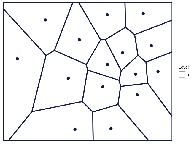
Figure 2: The Voronoi tessellation for level 1 shown for the 15 cells in the dataset ’computers’
As per the manual, hvt.results[[3]] gives us detailed information about the hierarchical vector quantized data
hvt.results[[3]][['summary']] gives a nice tabular data containing no of points, quantization error and the codebook.
Now let us understand what each column in the summary table means
Segment Level - Level of the cell. In this case, we have performed vector quantization for depth 1. Hence Segment Level is 1
Segment Parent - Parent Segment of the cell
Segment Child - The children of a particular cell. In this case, first level has 15 cells Hence, we can see Segment Child 1,2,3,4,5 ,..,15.
n - No of points in each cell
Quant.Error - Quantization error for each cell
All the columns after this will contains centroids for each cell built using all the variables. They can be also called as codebook as is the collection of centroids for all cells (codewords)
# Model summary
summary(hvt.results[[3]][['summary']])
#>  Segment.Level Segment.Parent Segment.Child        n          Quant.Error
#>  Min.   :1     Min.   :1      Min.   : 1.0   Min.   : 97.0   Min.   :0.2226
#>  1st Qu.:1     1st Qu.:1      1st Qu.: 4.5   1st Qu.:235.0   1st Qu.:0.2665
#>  Median :1     Median :1      Median : 8.0   Median :288.0   Median :0.3002
#>  Mean   :1     Mean   :1      Mean   : 8.0   Mean   :333.8   Mean   :0.3422
#>  3rd Qu.:1     3rd Qu.:1      3rd Qu.:11.5   3rd Qu.:395.5   3rd Qu.:0.3985
#>  Max.   :1     Max.   :1      Max.   :15.0   Max.   :917.0   Max.   :0.5685
#>      price             speed               hd               ram
#>  Min.   :-1.0777   Min.   :-0.9091   Min.   :-0.8186   Min.   :-0.77231
#>  1st Qu.:-0.3689   1st Qu.:-0.6289   1st Qu.:-0.5916   1st Qu.:-0.59874
#>  Median : 0.2748   Median : 0.3274   Median : 0.1669   Median :-0.02232
#>  Mean   : 0.2597   Mean   : 0.2716   Mean   : 0.3537   Mean   : 0.31267
#>  3rd Qu.: 0.8611   3rd Qu.: 0.7256   3rd Qu.: 0.7234   3rd Qu.: 0.96682
#>  Max.   : 2.0097   Max.   : 2.6668   Max.   : 3.3627   Max.   : 2.45903
#>      screen              ads
#>  Min.   :-0.43713   Min.   :-2.16268
#>  1st Qu.:-0.38761   1st Qu.:-0.56782
#>  Median :-0.17335   Median : 0.09958
#>  Mean   : 0.02547   Mean   :-0.16868
#>  3rd Qu.: 0.09521   3rd Qu.: 0.48662
#>  Max.   : 2.87671   Max.   : 0.76484
Let’s have a look at Quant.Error variable in the above table. It seems that none of the cells have hit the quantization threshold error.
Now let’s check the compression summary. The table below shows no of cells, no of cells having quantization error below threshold and percentage of cells having quantization error below threshold for each level.
| segmentLevel | noOfCells | noOfCellsBelowQuantizationError | percentOfCellsBelowQuantizationErrorThreshold |
|---|---|---|---|
| 1 | 15 | 0 | 0 |
As it can be seen in the table above, percentage of cells in level1 having quantization error below threshold is 0%. Hence we can go one level deeper and try to compress it further.
We will now overlay the Quant.Error variable as heatmap over the voronoi tessellation plot to visualize the quantization error better.
Let’s have a look at the function hvtHmap which we will use to overlay a variable as heatmap.
PLotting the heatmap
hvtHmap(hvt.results, child.level, hmap.cols, color.vec ,line.width, palette.color = 6)
hvt.results - A list of hvt.results obtained from the HVT function.
child.level - A number indicating the level for which the heat map is to be plotted.
hmap.cols - The column number of column name from the dataset indicating the variables for which the heat map is to be plotted. To plot the quantization error as heatmap, pass 'Quant.Error'. Similarly to plot the number of points in each cell as heatmap, pass 'no_of_points' as a parameter
color.vec - A color vector such that length(color.vec) = child.level (default = NULL)
line.width - A line width vector such that length(line.width) = child.level. (default = NULL)
palette.color - A number indicating the heat map color palette. 1 - rainbow, 2 - heat.colors, 3 - terrain.colors, 4 - topo.colors, 5 - cm.colors, 6 - BlCyGrYlRd (Blue,Cyan,Green,Yellow,Red) color. (default = 6)
show.points - A boolean indicating if the centroids should be plotted on the tessellations. (default = FALSE)
quant.error.hmap - A number indicating the quantization error threshold
nclust.hmap - A boolean No of points in each cell.
Now let’s plot the quantization error for each cell at level one as heatmap.
# Plotting the heatmap for Level 1
muHVT::hvtHmap(hvt.results,
        traincomputers,
        child.level = 1,
        hmap.cols = "Quant.Error",
        color.vec = "black",
        line.width = 0.8,
        palette.color = 6,
        show.points = T,
        centroid.size = 2,
        quant.error.hmap = 0.2,
nclust.hmap = 15) 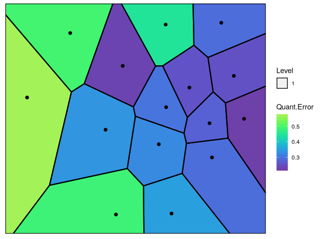
Figure 3: The Voronoi tessellation with the heat map overlayed with variable ’Quant.Error’ in the ’computers’ dataset
Now let’s go one level deeper and perform hierarchical vector quantization.
# Building the required model for level 2
set.seed(240)
hvt.results2 <- list()
# depth=2 is used for level2 in the hierarchy
hvt.results2 <- muHVT::HVT(trainComputers,
                           nclust = 15,
                           depth = 2,
                           quant.err = 0.2,
                           projection.scale = 10,
                           normalize = T,
                           distance_metric = "L1_Norm",
                           error_metric = "mean")
To plot the voronoi tessellation for both the levels.
# Voronoi tessellation plot for level two
muHVT::plotHVT(hvt.results2,
        line.width = c(1.2, 0.8),
        color.vec = c("#141B41","#0582CA"),maxDepth = 2)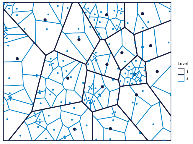
Figure 4: The Voronoi tessellation for level 2 shown for the 225 cells in the dataset ’computers’
In the table below, Segment Level signifies the depth.
Level 1 has 15 cells
Level 2 has 225 cells .i.e. each cell in level1 is divided into 225 cells
Let’s analyze the summary table again for Quant.Error and see if any of the cells in the 2nd level have quantization error below quantization error threshold. In the table below, the values for Quant.Error of the cells which have hit the quantization error threshold are shown in red. Here we are showing just top 50 rows for the sake of brevity.
# Model summary
head(hvt.results2[[3]][['summary']])

#>   Segment.Level Segment.Parent Segment.Child   n Quant.Error      price      speed
#> 1             1              1             1 480   0.3264675  0.6912387  0.6959344
#> 2             1              1             2 390   0.4855699  0.8269279  0.2118000
#> 3             1              1             3 145   0.3507855  0.2748086  2.6668336
#> 4             1              1             4 505   0.2568036 -0.1690919 -0.7959514
#> 5             1              1             5 241   0.2761964 -0.3430079  0.6562515
#> 6             1              1             6 150   0.4914133  0.8951958 -0.5463372
#>            hd         ram      screen        ads
#> 1  0.23822832 -0.02231718  0.06167149  0.5718800
#> 2  0.05060655  0.09714376  2.87671456  0.0995764
#> 3  0.16693873 -0.20297608 -0.17335439  0.7080667
#> 4  0.24229321 -0.03662846 -0.31059954  0.4191436
#> 5 -0.73373515 -0.74735973 -0.39749682 -0.4032370
#> 6  2.71421808  2.32200038  0.28522616 -0.5994251
The users can look at the compression summary to get a quick summary on the compression as it becomes quite cumbersome to look at the summary table above as we go deeper.
| segmentLevel | noOfCells | noOfCellsBelowQuantizationError | percentOfCellsBelowQuantizationErrorThreshold |
|---|---|---|---|
| 1 | 15 | 0 | 0 |
| 2 | 134 | 118 | 0.881 |
As it can be seen in the table above, only 88% cells in the 2nd level have quantization error below threshold. Therefore, we can go one more level deeper and try to compress the data further.
We will look at the heatmap for quantization error for level 2.
# Heatmap plot for Level 2
muHVT::hvtHmap(hvt.results2,
        child.level = 2,
        hmap.cols = "Quant.Error",
        color.vec = c("black","black"),
        line.width = c(0.8,0.4),
        palette.color = 6,
        show.points = T,
        centroid.size = 2,
        quant.error.hmap = 0.2,
nclust.hmap = 15) 
Figure 5: The Voronoi tessellation with the heat map overlayed with variable ’Quant.Error’ in the ’computers’ dataset
Now once we have built the model, let us try to predict using our test dataset which cell and which level each point belongs to.
Let us see predictHVT function.
# Code to predict the position of new data points from test set
predictHVT(data,hvt.results,hmap.cols = NULL,child.level = 1,...)
Important parameters for the function predictHVT
data - A dataframe containing test dataset. The dataframe should have atleast one variable used while training. The variables from this dataset can also be used to overlay as heatmap.
hvt.results - A list of hvt.results obtained from HVT function while performing hierarchical vector quantization on train data
hmap.cols - The column number of column name from the dataset indicating the variables for which the heat map is to be plotted.(Default = NULL). A heatmap won’t be plotted if NULL is passed
child.level -A number indicating the level for which the heat map is to be plotted.(Only used if hmap.cols is not NULL)
quant.error.hmap - A number indicating the quantization error threshold
nclust.hmap - A boolean No of points in each cell.
... - color.vec and line.width can be passed from here
# Building the prediction model
set.seed(240)
predictions <- muHVT::predictHVT(testComputers,
                          hvt.results2,
                          child.level = 2,
                          hmap.cols = "Quant.Error",
                          color.vec = c("black","black", "black"),
                          line.width = c(0.8,0.4,0.2),
                          quant.error.hmap = 0.2,
nclust.hmap = 15)The prediction algorithm recursively calculates the distance between each point in the test dataset and the cell centroids for each level. The following steps explain the prediction method for a single point in test dataset :-
Let’s see what cell and which level do each point belongs to. For the sake of brevity, we will
head(predictions$predictions)


#>     price speed   hd ram screen ads Cell_path Segment.Level Segment.Parent Segment.Child
#>  1  1540    33  214   4     15 191   2->9->2             2              9             2
#>  2  3094    50 1000  24     15 191   2->6->7             2              6             7
#>  3  1794    50  214   4     14 191   2->5->5             2              5             5
#>  4  2408   100  270   4     14 191   2->3->2             2              3             2
#>  5  2454    66  720  16     15 191 2->11->13             2             11            13
#>  6  1969    66 1000   8     14 191   2->8->5             2              8             5
We can see the predictions for some of the points in the table above. The variable cell_path shows us the level and the cell that each point is mapped to. The centroid of the cell that the point is mapped to is the codeword (predictor) for that cell.
The prediction algorithm will work even if some of the variables used to perform quantization are missing. Let’s try it out. In the test dataset, we will remove screen and ads.
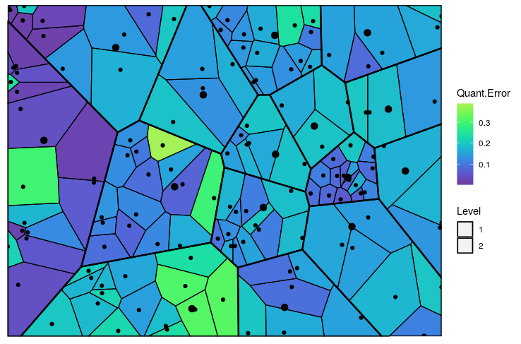
Figure 6: The predicted Voronoi tessellation with the heat map overlayed with variable ’Quant.Error’ in the ’computers’ dataset
Pricing Segmentation - The package can be used to discover groups of similar customers based on the customer spend pattern and understand price sensitivity of customers
Market Segmentation - The package can be helpful in market segmentation where we have to identify micro and macro segments. The method used in this package can do both kinds of segmentation in one go
Anomaly Detection - This method can help us categorize system behaviour over time and help us find anomaly when there are changes in the system. For e.g. Finding fraudulent claims in healthcare insurance
The package can help us understand the underlying structure of the data. Suppose we want to analyze a curved surface such as sphere or vase, we can approximate it by a lot of small low-order polygons in the form of tessellations using this package
In biology, Voronoi diagrams are used to model a number of different biological structures, including cells and bone microarchitecture
Using the base idea of Systems Dynamics, these diagrams can also be used to depict customer state changes over a period of time
Vector Quantization : https://ocw.mit.edu/courses/electrical-engineering-and-computer-science/6-450-principles-of-digital-communications-i-fall-2006/lecture-notes/book_3.pdf
K-means : https://en.wikipedia.org/wiki/K-means_clustering
Sammon’s Projection : http://en.wikipedia.org/wiki/Sammon_mapping
Voronoi Tessellations : http://en.wikipedia.org/wiki/Centroidal_Voronoi_tessellation
For more detailed examples of different usage to construct voronoi tessellations for 3D sphere and torus can be found here at the vignettes directory inside the project repo
For any queries related to bugs or feedback, feel free to raise the issue in github issues page