SHAP (SHapley Additive exPlanations, [1]) is an ingenious way to study black box models. SHAP values decompose - as fair as possible - predictions into additive feature contributions. Crunching SHAP values requires clever algorithms by clever people. Analyzing them, however, is super easy with the right visualizations. The “shapviz” package offers the latter:
sv_dependence(): Dependence plots to study feature
effects (optionally colored by heuristically strongest interacting
feature).sv_importance(): Importance plots (bar plots and/or
beeswarm “summary” plots) to study variable importance.sv_waterfall(): Waterfall plots to study single
predictions.sv_force(): Force plots as an alternative to waterfall
plots.These plots require a “shapviz” object, which is built from two things only:
S: Matrix of SHAP valuesX: Dataset with corresponding feature valuesFurthermore, a baseline can be passed to represent an
average prediction on the scale of the SHAP values.
A key feature of “shapviz” is that X is used for
visualization only. Thus it is perfectly fine to use factor variables,
even if the underlying model would not accept these. Additionally, in
order to improve visualization, it can sometimes make sense to clip
gross outliers, take logarithms for certain columns, or replace missing
values by some explicit value.
To further simplify the use of “shapviz”, we added direct connectors to the R packages
CatBoost is
not included, but see the vignette how to use its SHAP calculation
backend with “shapviz”.
# From CRAN
install.packages("shapviz")

# Or the newest version from GitHub:
# install.packages("devtools")
devtools::install_github("mayer79/shapviz")Shiny diamonds… let’s model their prices by four “c” variables with XGBoost:
library(shapviz)
library(ggplot2)
library(xgboost)

set.seed(3653)

X <- diamonds[c("carat", "cut", "color", "clarity")]
dtrain <- xgb.DMatrix(data.matrix(X), label = diamonds$price)

fit <- xgb.train(
  params = list(learning_rate = 0.1, objective = "reg:squarederror"),
  data = dtrain,
  nrounds = 65L
)One line of code creates a “shapviz” object. It contains SHAP values
and feature values for the set of observations we are interested in.
Note again that X is solely used as explanation dataset,
not for calculating SHAP values.
In this example, we construct the “shapviz” object directly from the
fitted XGBoost model. Thus we also need to pass a corresponding
prediction dataset X_pred used for calculating SHAP values
by XGBoost.
X_small <- X[sample(nrow(X), 2000L), ]

shp <- shapviz(fit, X_pred = data.matrix(X_small), X = X_small)
Note: If X_pred would contain one-hot-encoded dummy
variables, their SHAP values could be collapsed by the
collapse argument of shapviz().
Let’s explain the first prediction by a waterfall plot:
sv_waterfall(shp, row_id = 1)
Or alternatively, by a force plot:
sv_force(shp, row_id = 1)
We have decomposed 2000 predictions, not just one. This allows us to study variable importance at a global model level by studying average absolute SHAP values or by looking at beeswarm “summary” plots of SHAP values.
sv_importance(shp)
sv_importance(shp, kind = "beeswarm")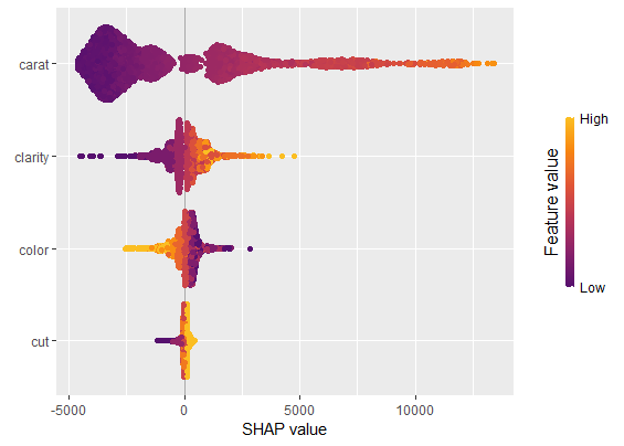
sv_importance(shp, kind = "both", show_numbers = TRUE, width = 0.2)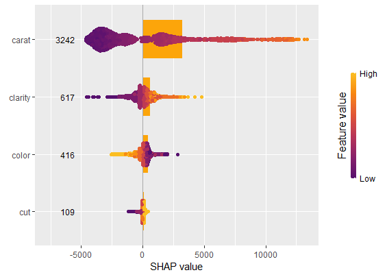
A scatterplot of SHAP values of a feature like color
against its observed values gives a great impression on the feature
effect on the response. Vertical scatter gives additional info on
interaction effects. “shapviz” offers a heuristic to pick another
feature on the color scale with potential strongest interaction.
sv_dependence(shp, v = "color", "auto")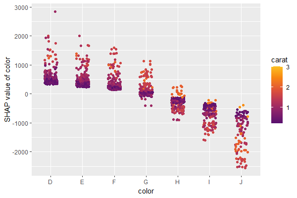
Check out the package help and the vignette for further information.
[1] Scott M. Lundberg and Su-In Lee. A Unified Approach to Interpreting Model Predictions. Advances in Neural Information Processing Systems 30 (2017).